Recently my business partner and I launched a new service, jobletter.io with a simple premise: We deliver Junior Developer jobs to your inbox.
Breaking into development to get those all-important first two years of production experience is long, exhausting work, filled with pouring through a lot of “Software Developer - 5+ years req” posts and keyword salads where your prospective employer’s stack includes Every Goddamn Thing™.
It makes the idea of a short list of quality, curated, 0 years of experience-and-up jobs, delivered to you, pretty appealing.
On January 7th, we launched a short landing page to test just how appealing. As the title of the blog post suggests, we were delighted with our results.
The Landing Page
David and I both work full-time as software developers, but for this we wanted to contract the design and coding out to a freelancer we both know and have been happy with on previous projects (she was the source behind my recent book site). She’s cost-effective, quick, and has a designer’s eye for small, interactive touches and mobile-compatibility. She hasn’t even given up on tablets like the rest of the world, God bless her.
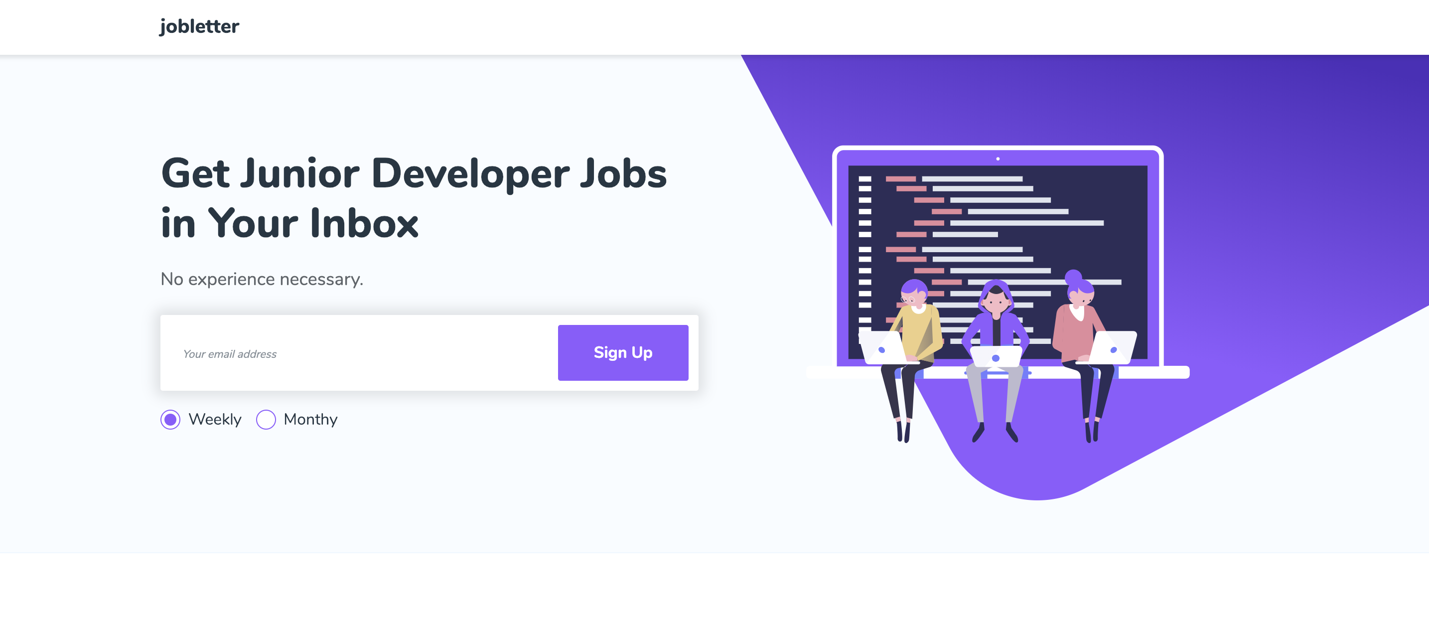
After giving her a mockup that looked as simple as a fake email field, an “icon here” placeholder and our title and subtitle “Junior Developer jobs in your inbox”, we got this back, which we were very happy with.

We were particularly impressed with how good it broke down to mobile. It also fulfilled our landing page goals:
- It foregrounded the CTA, making it one of the first things you see
- It provided a quick tag, but otherwise kept the appeal short
- The entire thing was very simple and lightweight, from both coding and information architecture standpoints.
Just Getting It Up There
The landing page is still pretty basic. It needs a few meat-and-potatoes elements like an “About” page (“Hi! We’re developers and nice.”) and a dedicated Privacy page, maybe an example email. We could also ship with localization, add some CI/CD bells and whistles…
But we made the Lean decision very consciously to ship our MVP and then use that early response for idea validation and feedback.
We received the landing page as a zipped directory of static assets in a Gitlab repository. From there it was a simple drag-n-drop on Netlify to go from her deliverable to our site - though it would take more to make it fully functional. Netlify was a great choice to achieve this kind of rapid prototype-to-alpha functionality, because it can integrate with a custom domain for free and you can also get forms or basic identity tracking as add-on extensions. A site and custom domain was enough for this project though.
To take it to launch-ready, I added GA for basic tracking and Mailchimp for our subscription functionality. After hooking up the two landing page fields to Mailchimp and adding the GA script to be injected by Netlify in the post-processing stage, we were ready to collect signups - and test the idea.
Acquisition Notes
We were initially hesitant to peg a goal to our user count during sprint planning - it’s not a metric we can really control. But thinking it would be a good benchmark, missing or making it, we set a goal for ourselves to acquire 50 users in the first two weeks.
We hit that number the first Friday.
We had a simple strategy for promoting the site. In the shared Google Drive we use to collaborate on the project, we created an “Acquisition” file where we outlined channels and content ideas. We also created a running list of all the outlets we posted to, (like this one on /r/growmybusiness ), that were principally concerned with getting feedback on the idea and design. The stealth advantage, of course, is that developer-founders and side project enthusiasts are also a potential market for our product. Then, without spamming too much, we tried to go through those applicable subreddits, one by one.
The disadvantage to this strategy is that it’s a one-shot thing. You can’t keep spamming these forums with the same stale content because it’s both ineffective and pretty offensive. To move forward, we’ll need another content strategy.
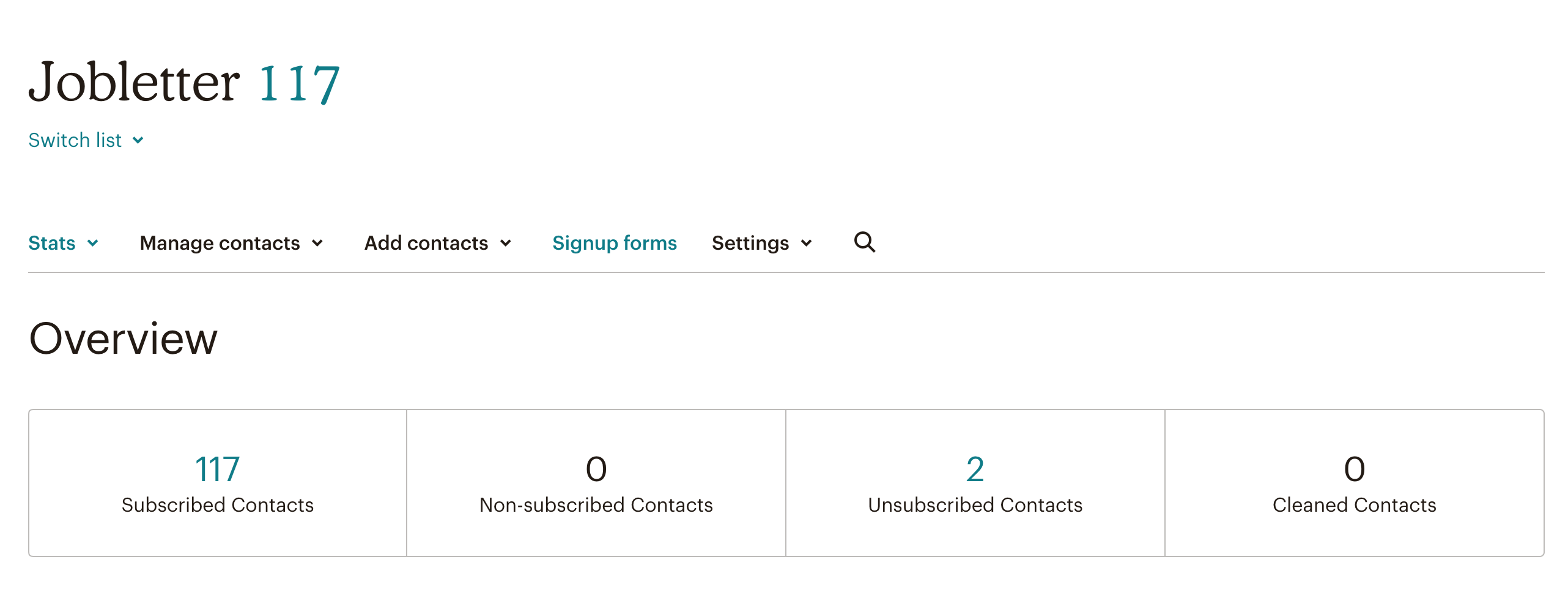
But in the short term, the strategy paid off. By the end of the period, we had 117 signups.

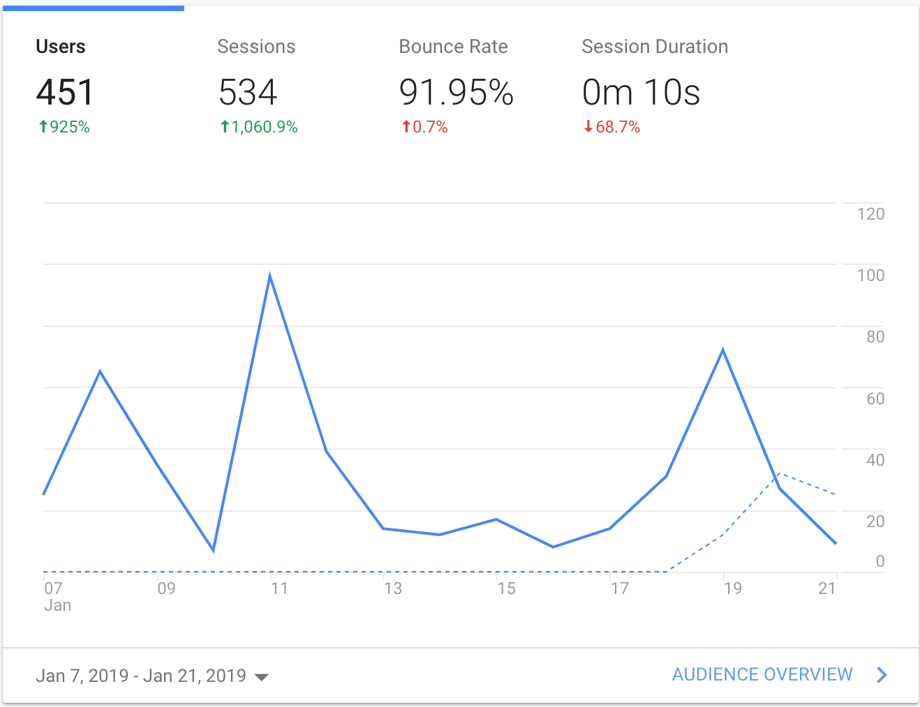
Considering that we only got 451 total users according to analytics, that gives us a conversion rate of 25.9%.

What we shouldn’t have been surprised to discover is that junior developers are hungry for sources of applicable, career-jumpstarting positions, and they’re not too shy about parting with their email for it.
Though sadly I didn’t ship the MVP with the all the appropriate Goals and GA instrumentation, we could get a rough idea from our signup email notifications when a particular subreddit or comment would catch on.
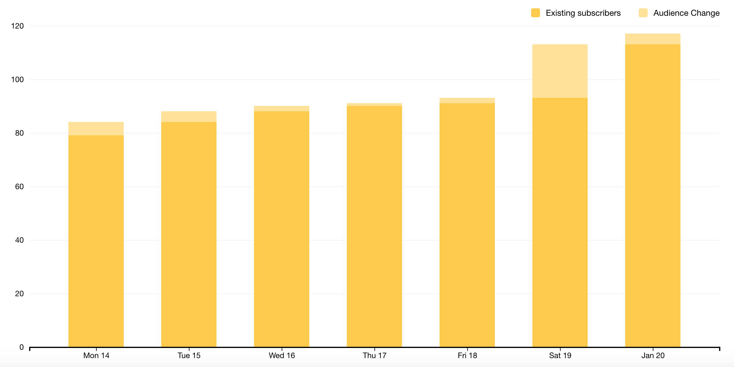
In graphs like this Mailchimp one below, you can see the steady trickle of new signups interrupted by a big new inflow - this one was a post to r/entrepreneur and a related subreddit.

Lessons Learned
100 users in two weeks hardly makes jobletter the new iPhone. But there have been some small takeaways - some easy successes - that I think represent a victory not just for this particular idea, but the philosophy behind our strategy generally.
The Value of Expertise in Judgement
At every point of what we’ve done, we could have hand-made that part of the product ourselves. We could have designed and coded the landing page instead of just mocking it up, we could have homebrewed some email signup system to use, etc. But we intentionally signed up for services or paid people very reasonable sums to do it better than we could, in a shorter amount of time. Our backgrounds - which include working heavily with contractors - mean that we can understand and vet the work we receive from outside sources without relying on it as a “black box” or requiring someone else to explain it. But just because we can do it, doesn’t mean we should do it ourselves. As developers, fighting that instinct is a constant struggle - but one that pays off.
Design is a Form of Authority
We got so many compliments on our design and the professionalism of it - and our target market, developers, is so design-savvy - it leaves little doubt that having a polished site was critical to our conversion rate. This is another place where hiring someone for a simple job, that nevertheless benefited from their detailed expertise, was the right move over doing it ourselves.
Get It Up Rough
There were many decisions we could’ve made to extend the work pre-launch: We considered rewriting the LP into one of our JS MVCs of choice, to make it more interactive and extensible; we thought about multiple hosting architectures; we floated the idea of shipping it with other analytical tools backed in. But ultimately we benefitted from launching it as quick-and-dirty as we could. Working through an idea like this is both easier and more motivating when you’ve already started to build the tiniest amount of interest. And the number of things able to “block” a launch can cascade into such a series of issues that you’re buried under them. By launching early, you can triage the things that actually matter and let the premature optimizations go un-optimized.
Conclusion
Our little experiment in side business-ry is in its early days. But it’s already provided a useful education as we’ve begun to put some Agile / Lean precepts into action. Like working through a Mathmatical proof from first principles or learning the hard way about burning your hand on that hot, hot stove, putting these ideas into action has led to a deeper understanding of them.
